Hudson Hotel New York: review, Video & Photos. SO small So Funky So horrible!
From the moment that you arrive you know that you are going to a hotel like no other, as there is no name to identify the place. You then travel up some very long and striking yellow light escalators and emerge into a gloomy lobby. Music is pumping away and you really cannot see very much as it is very dark. You can make out a huge long check-in desk with a massive trendy chandelier hanging above it.
As you check in you will usually hear people complaining about the size of their rooms and the staff explaining that the rooms are that size and it is not just that they have been allocated a tiny room. I did think that people were probably being a bit fussy and over dramatic, until I went to my own room. Getting to the room was another surprise as the hallways are incredibly dark as well.
The rooms are very small, around 125 square feet. If they were very cheap then this would be less of an issue. But they are not. On the positive side they are a masterpiece of clever design by squeezing so much in to such a small space.
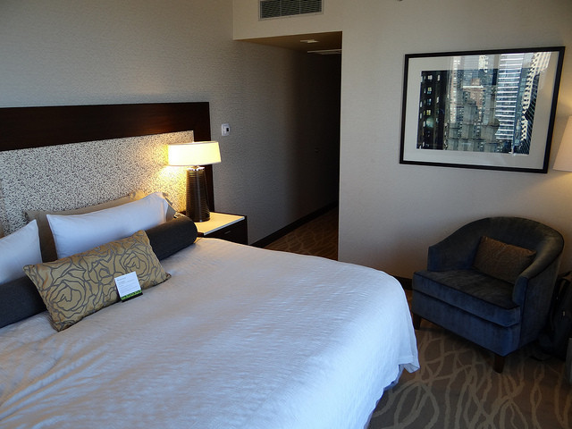
But no matter what your view on design is, the fact is the rooms feel cramped and unpleasant to stay in. The dark wood panels making it feel oppressive. There is around 1.5 feet on either side of the low bed. The bathroom is hard to move around in as you squeeze past the toilet to get into the shower that has a glass panel into the bedroom. There is a small TV and a CD player in the room – but no real space to put luggage and much clothes. If there were 2 of you in the rooms it would be really cramped.
The restaurant in the hotel is also dark, but here the design is very stunning with the kitchen in the centre and long tables. The food is excellent. The buffet breakfast ($27) was excellent as well.
The main bar on the lobby level has glass floors with light underneath. They are very fussy about keeping the look and would not let us put our coats over the back of the chairs. There is also a “library” that is also great design and more comfortable.
The fitness room is pretty good with a fair selection of cardio machines and weight machines. The meeting rooms are very ordinary considering the rest of the hotel.
As you can imagine, I will avoid staying here. I had to stay in the hotel for 4 nights and that was too long!


